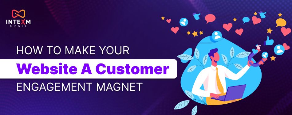
How to Make Your Website a Customer Engagement Magnet
How to Make Your Website a Customer Engagement Magnet
Ever walk into a store that looks amazing — polished floors, bright lights, trendy layout — but somehow, you leave without buying anything? No spark, no conversation, no connection.
That’s exactly what happens with so many websites today.
Sure, they’re beautiful. They load fast. They’ve got all the trendy UI/UX elements. But they’re missing soul. They don’t feel like a space you want to explore. They don’t draw you in or make you stay.
If your website isn’t keeping people curious, excited, or emotionally invested, then it’s time for a serious glow-up.
Let’s break down exactly how to turn your site from a digital brochure into a customer engagement magnet.
First Impressions Are Like First Dates: Make Them Count
Visitors judge your site in seconds — and we mean seconds.
You’ve got one shot to make a lasting first impression. If it doesn’t resonate immediately, the back button wins.
So, what makes a homepage magnetic?
It’s not about flashy animations or wild colour schemes. It’s about clarity + value.
Start with a clear, bold headline. Not clever. Not cryptic. Clear. Tell people what problem you solve — and why it matters to them. Add a benefit-driven subheading that speaks directly to their pain points.
Pair that with clean design, fast load times, and mobile-friendliness, and boom — you’ve got their attention.
Make Navigation So Easy, a Toddler Could Do It
Ever walked into a new place and had no clue where to go? That’s what confusing websites do.
You want your visitors to glide through your site, not feel like they’re solving a puzzle.
Keep your menu simple. Use everyday language. “About,” “Services,” “Contact” — these aren’t boring; they’re familiar. Add a sticky nav bar so people can always find their way, and keep it consistent across pages.
Want bonus points? Add a search bar. It’s like giving your visitors a personal GPS — one that makes exploring effortless.
Write Like You’re Talking to a Friend (Not a Robot)
Let’s be honest. Nobody sticks around to read content that sounds like it came out of a corporate handbook.
People want personality. They want a human touch.
So ditch the jargon. Write how you speak. Use contractions, pop culture references, even emojis — if it matches your brand. Focus less on features and more on benefits. Speak to their needs, not your process.
Content that connects doesn’t just sound good. It feels right.
CTAs That Don’t Feel Like Demands
“Click here.” “Buy now.” “Submit.”
Hard pass.
Your calls-to-action (CTAs) should feel like an invitation — not an obligation. Try “Let’s Get Started,” or “Send Me My Freebie.” Make it warm, specific, and outcome-focused.
And don’t wait until the end to use them. Scatter CTAs throughout your page — where they feel natural. Match them with bold design and contrast so they stand out but don’t scream.
A good CTA should feel like a next step, not a final test.
Give Your Site a Personality (Yes, Really)
We’ve been trained to think “professional” equals “serious.” But that’s not how people connect online.
A little personality goes a long way.
Think playful microcopy, branded illustrations, or even a cheeky 404 page. Whether you’re sleek and modern or fun and quirky, let your vibe show through. Consistency builds brand memory — and emotional engagement.
Make your website feel less like a machine and more like a conversation.
Sprinkle in Smart Interactions
People remember experiences more than information.
Interactive features — like sliders, quizzes, chatbots, and hover effects — pull users in. They engage attention and give users a sense of control.
Even subtle interactions, like progress bars or scrolling animations, can turn passive reading into active exploration.
More interaction = more time on site = more chances to connect.
Personalization: From "Hey There" to "Hey You"
In the age of data, generic is out.
People expect personalization — and not just in emails. From tailored product recommendations to greeting returning visitors with custom banners, small touches go a long way.
Even language tweaks based on location or time of day can make users feel understood. And when people feel seen, they engage more.
Let Others Do the Talking (Hello, Social Proof!)
Trust is currency in the digital world.
Show testimonials, star ratings, video reviews — even screenshots of real feedback. People trust people more than brands.
Highlight the success stories that align with your audience’s goals. Add logos of clients or publications you've worked with. Link to review platforms if your reputation’s strong.
Social proof turns hesitation into confidence.
Keep the Conversation Going
Engagement doesn’t end when someone leaves your site.
Encourage email signups with lead magnets. Offer discounts or valuable guides. Nudge them on social. Set up retargeting to remind them you exist.
When your digital presence follows up (without being pushy), it keeps your brand alive in their mind.
The conversation doesn’t stop — it just continues somewhere else.
You’ve got the vision. We’ve got the fuel. At Intexm Media, we specialize in transforming websites into dynamic, engagement-driven experiences. We blend performance design with consumer psychology to make sure your visitors don’t just land — they stay, explore, and convert.
From behaviour-based personalization to content that sounds like your favorite podcast, we design every scroll, click, and call-to-action to pull users deeper into your brand journey. Our multi-channel expertise — including Meta, Google, programmatic, and native ads — ensures your engagement doesn’t end at the homepage.
Let’s turn your website into the most magnetic thing on the internet.
...